Browse vs Search
There is an often-overlooked but important distinction between browsing and searching. Browsing is a means of discovering what there is to search for - it starts with a base knowledge near zero, and builds ideas for the user until they know what they'd like. Searching starts from specific knowledge or needs from the user (they already know what they want), and helps them reduce the possibilities until they can find one like they were looking for.
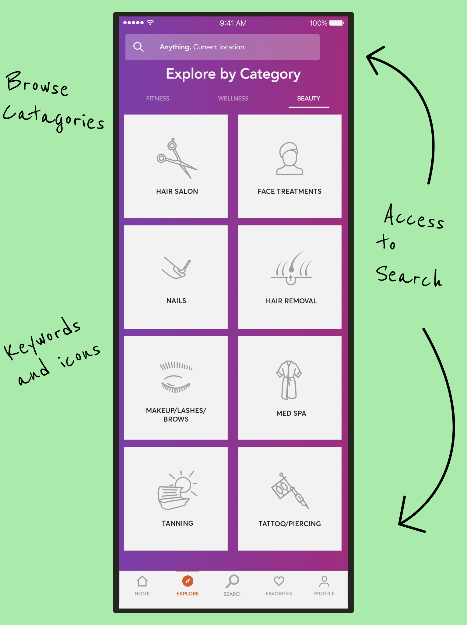
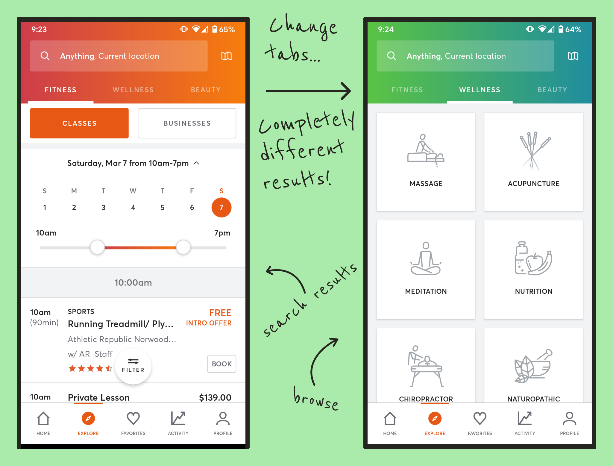
Originally, Mindbody blurred the lines between these two approaches - in fact, the Wellness and Beauty tabs on the results pages even redirected to the browse section (called "Explore" in the app), rather than to the search results for the term searched for. This was such a jarring and obvious bug, that it showed how infrequently the tabs were even being used as they are currently configured.
Our research showed that app users' past activities (their history, their favorites), and their preference for certain staff (which cannot be directly searched for at the moment) are the driving factors when Searching on the app.
Organizing Search Results
In MindBody's current design, search results are separated into tabs, defining three kinds of results: Fitness, Wellness, and Beauty. Is this helpful? When searching for Pilates or Hair Removal or a Massage, do we need help narrowing down whether it counts as Fitness or Wellness or Beauty? What is "Beauty Yoga", or "Wellness Hair Removal"? While there were some edge cases, we found that overwhelmingly, there was no real utility to be found here.
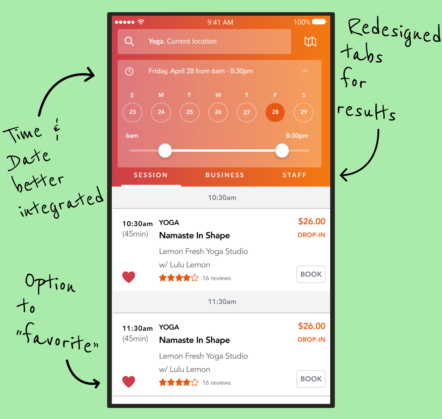
However, there was a missing need to follow individual professionals. Yoga instructors may teach three different classes at two separate facilities, and depending on who we are, we may be interested in a particular class, the studio, or the yogi themself. Therefore, separating the results into separate tabs for Session, Business, and Staff will give us that value. We carefully considered these three terms so that they could apply just as naturally to a Yoga Instructor, as to an Acupuncturist or a Tattoo Artist. We were also careful to make sure that the MindBody app already had a concept of a "Business" and "Staff" in the first place, so that results could be displayed this way at all, and that we weren't adding features that couldn't be supported by the backend datastructures.
Filtering Results
Filtering search results can be fickle. You don't want so many results that you can't find what you need among them, but you don't want to narrow it so much that you leave out results that may have been what you were looking for. This filtering tends to happen in two places, too - once when you type in your search terms (narrowing the results to fit those keywords) - and once when the results screen appears, such as how Amazon allows you to filter results by price ranges, brand, and so forth.
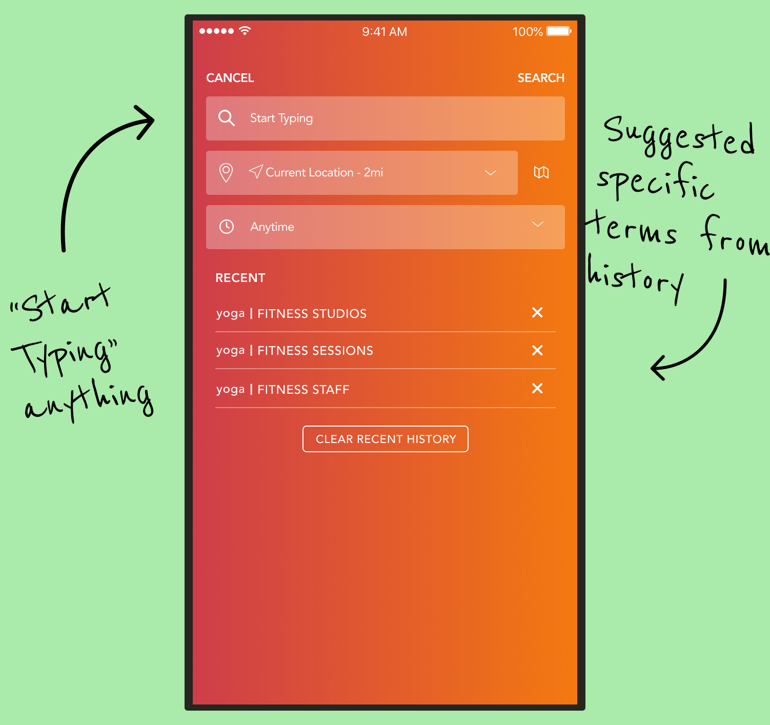
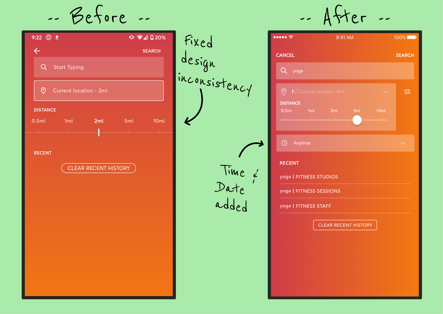
In their current state, MindBody offers two filters in the first step (the search field, and a "distance from current location" selector), and a few on the results page as well, including a date and time picker. We added this date and time picker to the first phase, because our research told us that users knew three general things when they searched - they knew what they wanted to do, and approximately where and when. They can still adjust this on the results page, but this placement allows for more accurate results on the first pass.
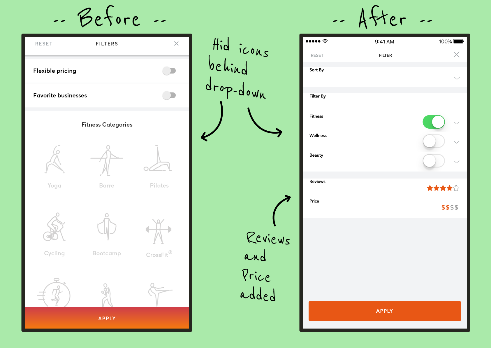
We also enhanced the remaining secondary filters that were in place. Firstly, no sorting options were previously available. Users expect to be able to sort on basic properties important to them, like price and rating. Additionally, the existing filters were too specific. For instance, why filter on whether the class specifically has "flexible pricing" (an ill-defined term within the app), when the important factor at the root of it is "how expensive is it?" Our filters provide broader applicability, and map better to the features users told us they care about the most.
Final Thoughts
MindBody may think of itself (and even brand itself) as a collection of experiences in Fitness, Wellness, and Beauty, but that doesn't mean that it's the best way to define those experiences in all parts of the app. Here, we see that the users already knew the most efficient way to interact with these businesses, but the search structure was making them work around it in inefficient ways. It reminds me of Desire Paths, those worn-down trails through the grass in a public area where pedestrians have constantly walked in the absence of an intentional paved lane (even when a paved path is indeed nearby). Looking for those trails of browned grass is often the best way to find the most efficient way through the space, and that's precisely where paved paths would be best placed.
Here's another important lesson: Not all design problems come with complaints. Many users loved the app DESPITE search flaws, and were often willing to completely overlook them because of it. That doesn’t mean they can’t be improved, or that users won’t notice when they have been improved. It simply reminds us that just asking "what are your problems with the app" isn't enough. You must often witness them experience the app, and see them encounter those problems, to know that those problems exist.